Chapter 10 Regression Methods
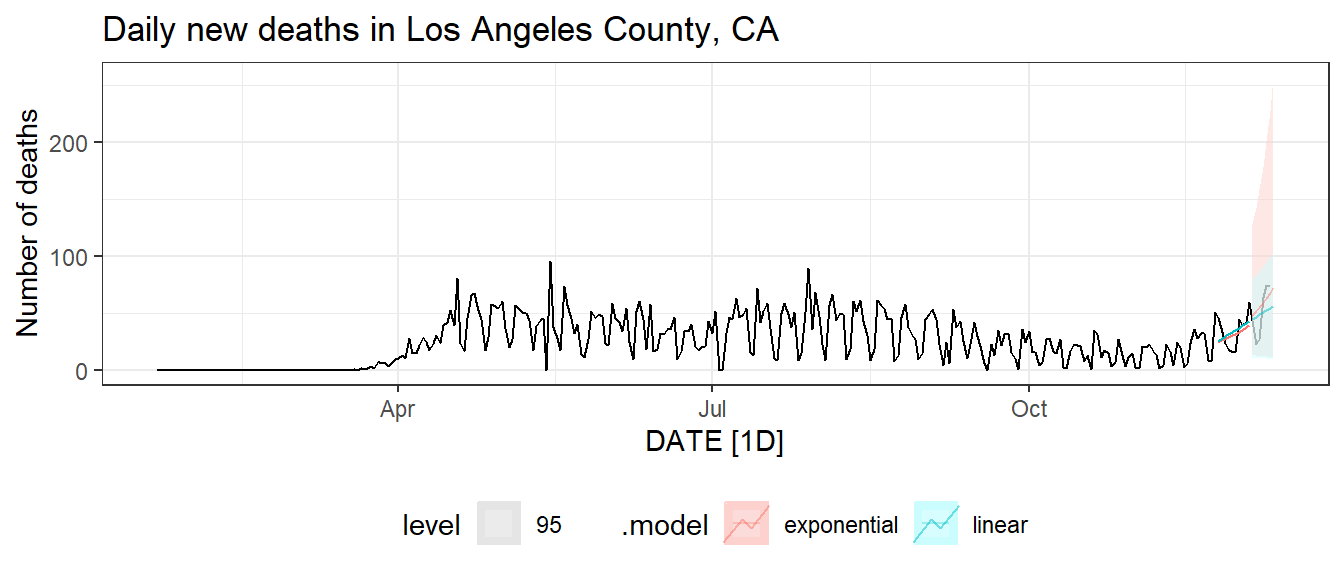
Figure 10.1: Reported death count with linear and exponential prediction.
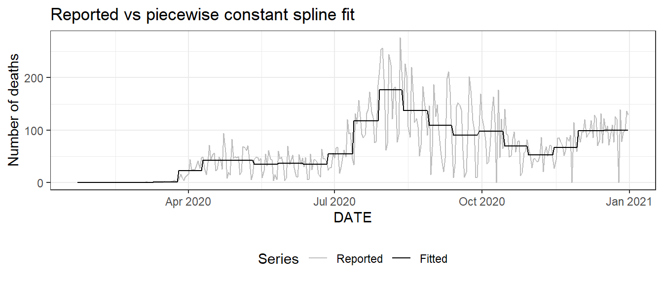
Figure 10.2: Piecewise constant spline smoothing for the daily new death count for Florida.
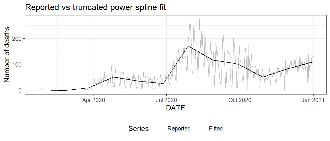
Figure 10.3: Truncated power spline smoothing for the daily new death count for Florida.
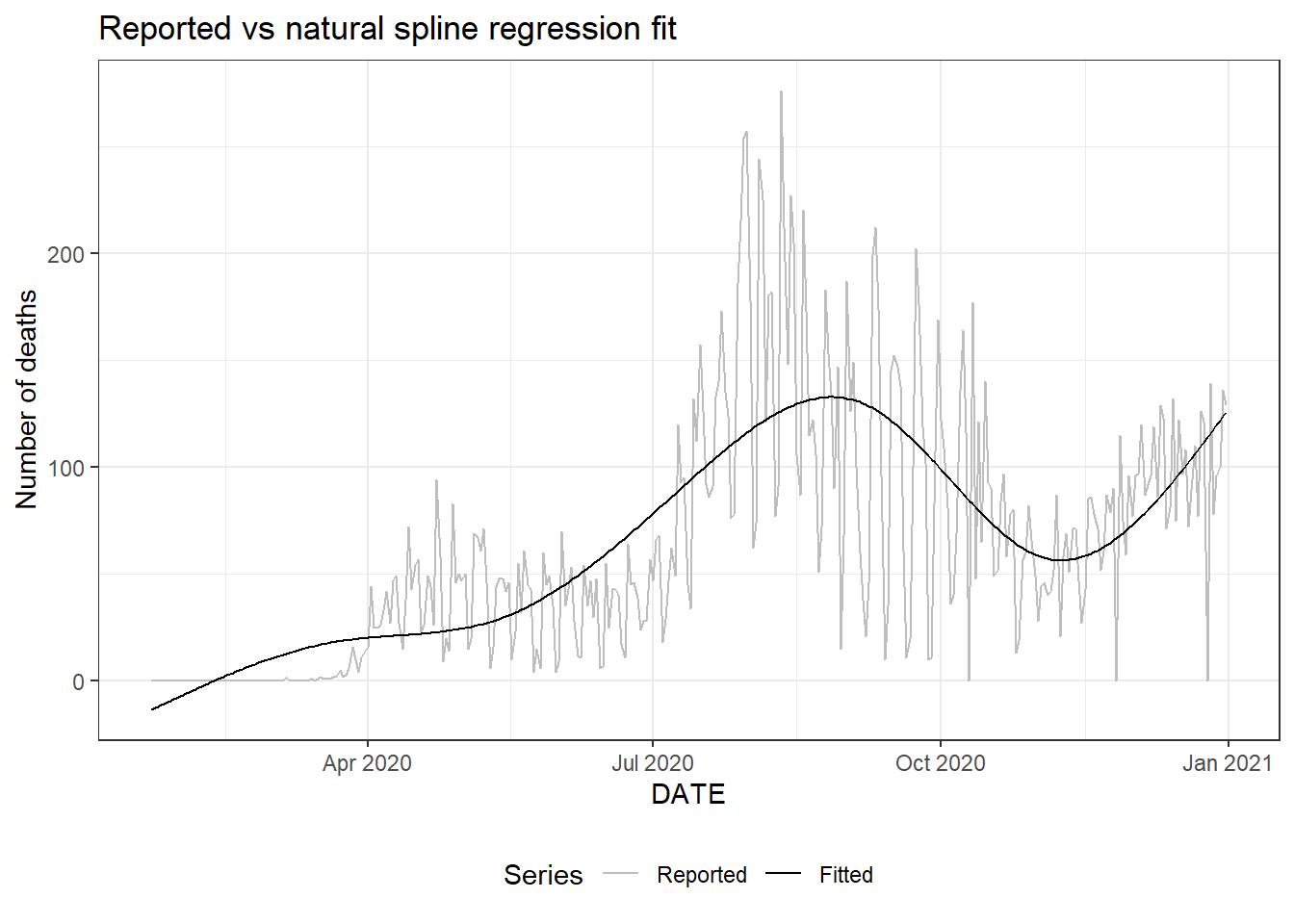
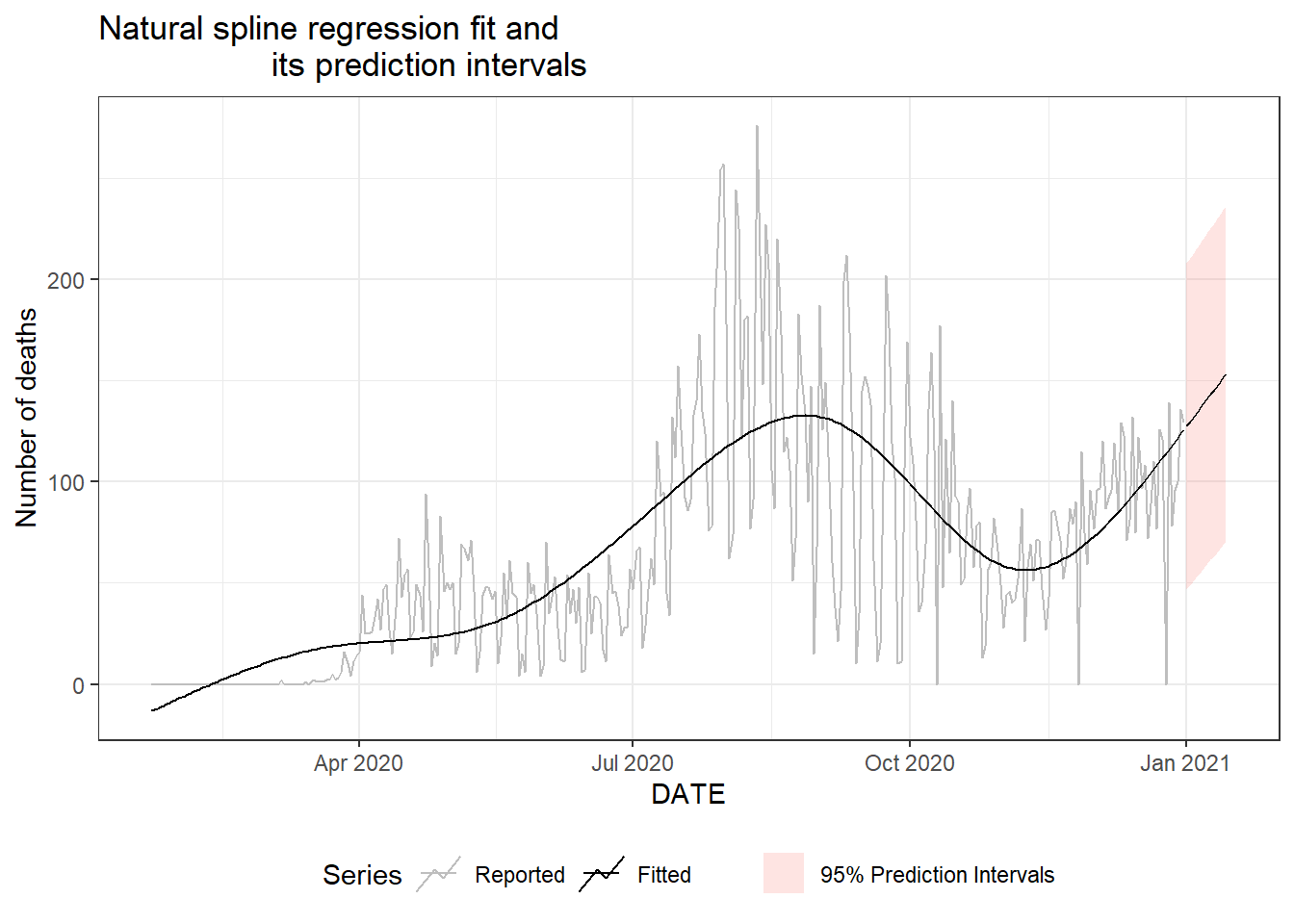
Figure 10.4: Plot for the daily new death count for Florida. Top: reported values vs fitted values using natural splines. Bottom: natural spline fit and its prediction intervals.
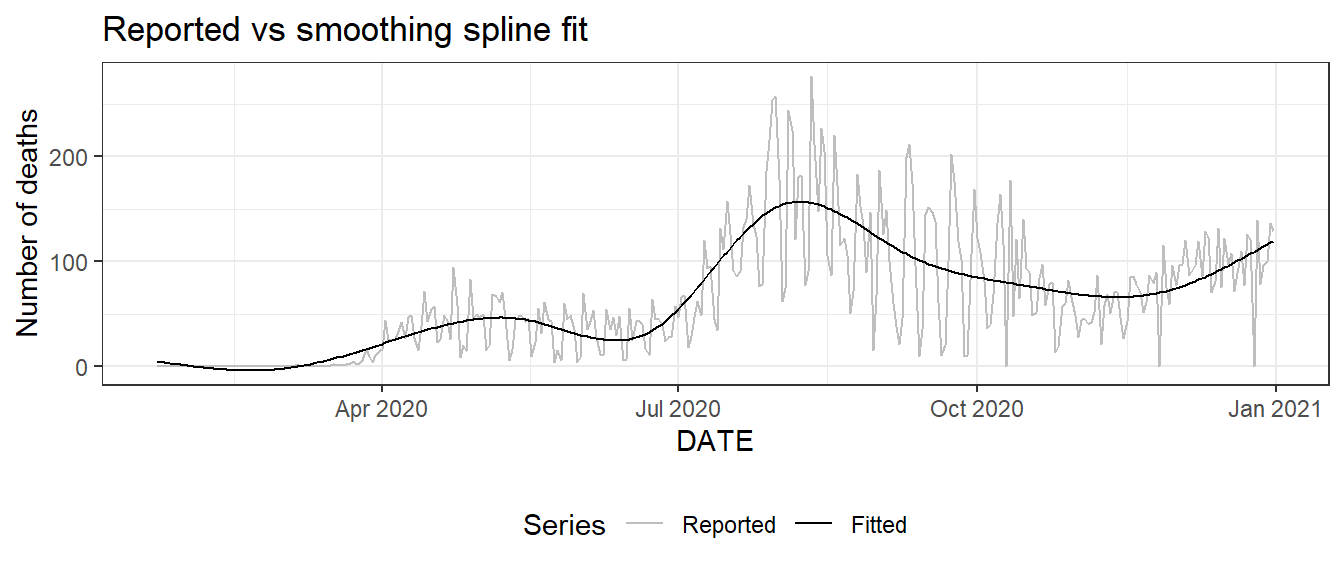
Figure 10.5: Plot for the daily new death count for Florida: reported values (light gray) and fitted values (black) using smoothing splines.
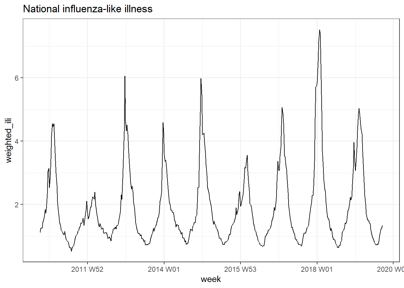
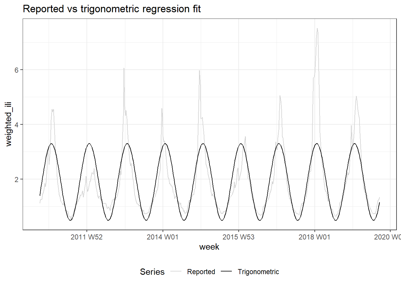
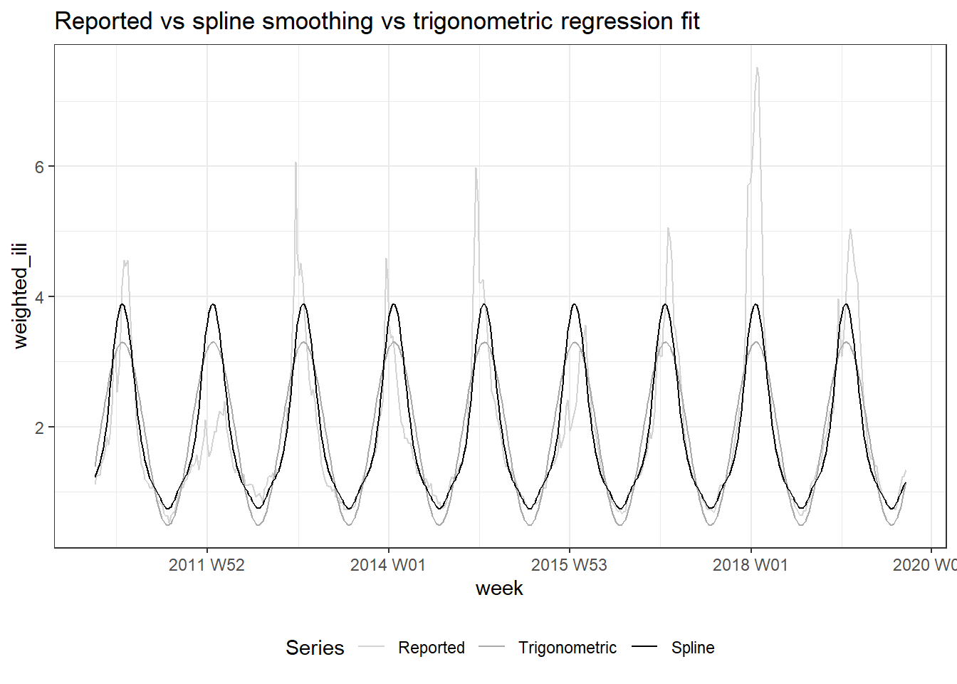
Figure 10.6: Top: National influenza-like illness weekly time series. Center: Reported vs trigonometric regression fit. Bottom: Spline smoothing vs trigonometric regression fit.
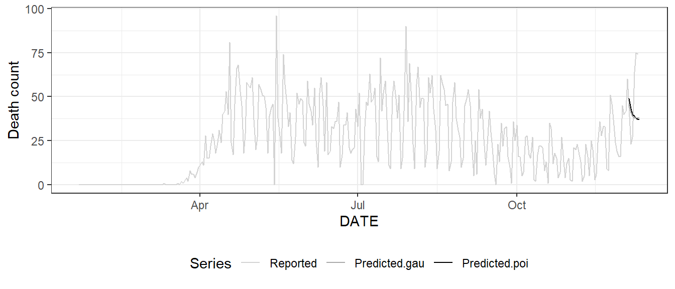
Figure 10.7: Reported and predicted death count for Los Angeles County via Poisson regression and ordinary linear regression.
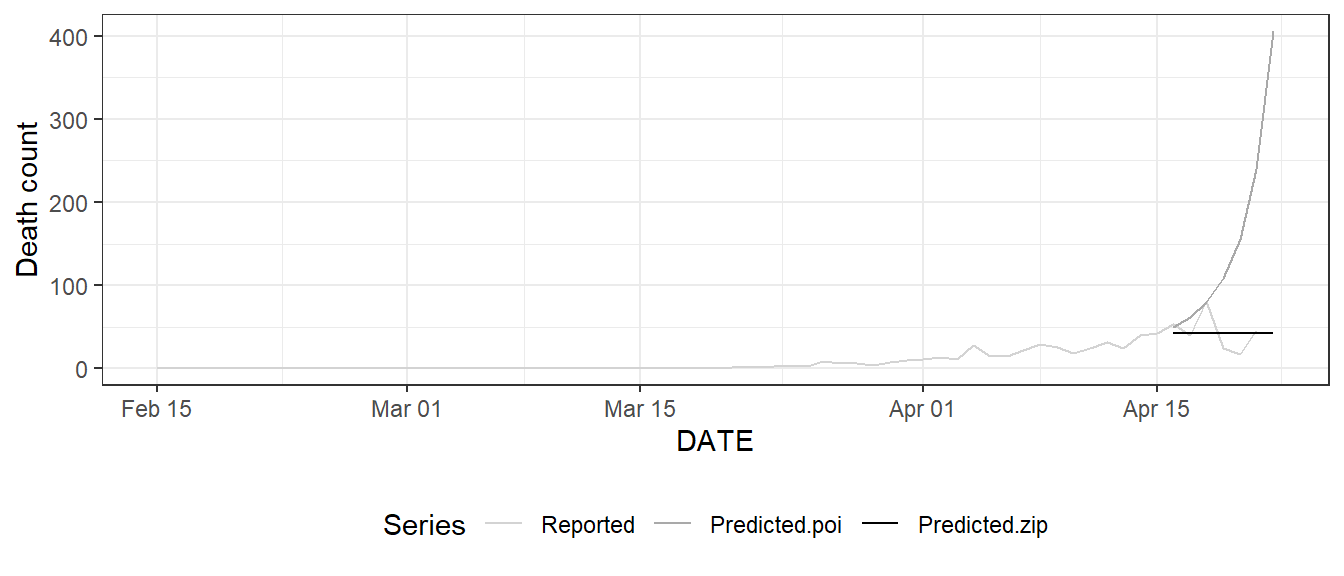
Figure 10.8: Reported and predicted death count for Los Angeles County via Poisson regression and zero-inflated Poisson regression; prediction is based on training data from February 15 to April 15, 2020.
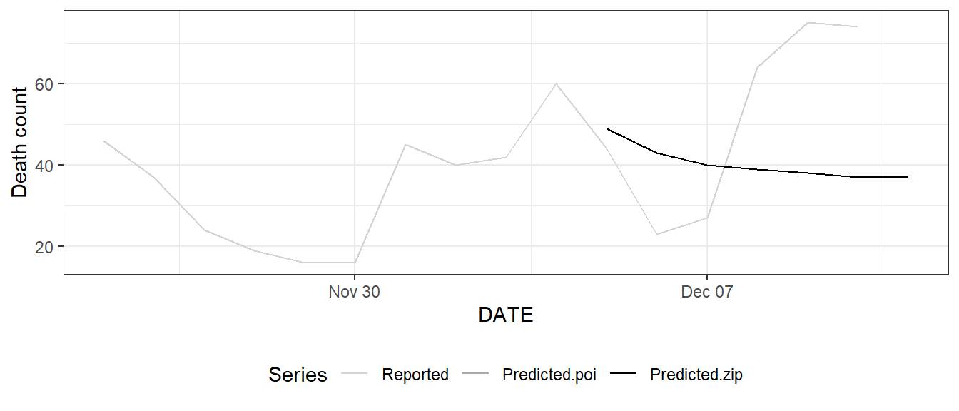
Figure 10.9: Reported and predicted death count for Los Angeles County via Poisson regression and zero-inflated Poisson regression; prediction is based on training data from November 25 to December 4, 2020. Here the two predictions overlap each other.
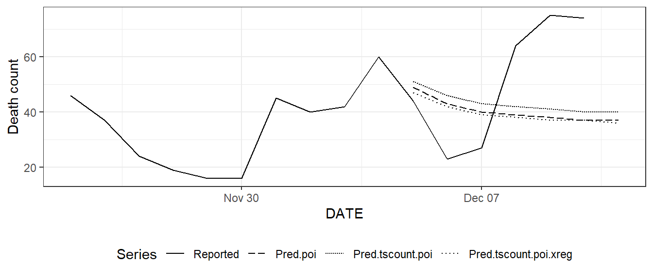
Figure 10.10: (ref:tsglm)
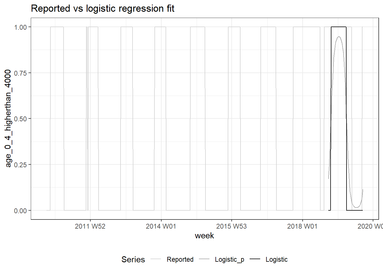
Figure 10.11: Whether national influenza-like illness weekly counts for age 0 - 4 exceeds 4000 (light gray) vs predicted conditional probability (dark gray) vs logistic regression prediction (black).