Chapter 4 Interactive Visualization
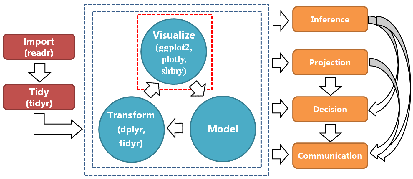
Figure 4.1: A typical data science process.
Figure 4.2: Top: Bar chart of the infected count.
Figure 4.2: Bottom: Modified bargraph of the infected count.
Figure 4.3: Bargraph of the infected count and death count.
Figure 4.4: Top: Bargraph of the infected count by adding bars
Figure 4.4: Bottom: Histogram of the log(daily new infected cases).
Figure 4.5: Top: A translated scatterplot from ggplot2 to to plotly.
Figure 4.5: Middle: A scatterplot with log(Death) vs log(Infected) using the state.long data
Figure 4.5: Bottom: Customized scatterplot by changeing the size and color of the markers.
Figure 4.6: Top: Time series plot of the cumulative infected count for Cook County, IL.
Figure 4.6: Middle: Time series plot using hoverinfo.
Figure 4.6: Bottom: Time series plot using hovertemplate.
CHECK: the first and second plot above are the same.
Figure 4.7: Top: Time series plot of the cumulative infected count for three counties using different options in the mode argument.
## Warning in RColorBrewer::brewer.pal(N, "Set2"): n too large, allowed maximum for palette Set2 is 8
## Returning the palette you asked for with that many colors

## Warning in RColorBrewer::brewer.pal(N, "Set2"): n too large, allowed maximum for palette Set2 is 8
## Returning the palette you asked for with that many colors
Figure 4.7: Middle: Time series plot of the cumulative infected count by mapping the value of a variable to color.
Figure 4.7: Bottom: Time series plot of the cumulative infected count by controlling the color scale.
Figure 4.8: Top: Time series plot of the cumulative infected count and predictions for Cook County, IL, with more features about the lines.
Figure 4.8: Bottom: An example of adding the ribbons to the previous time series plot.
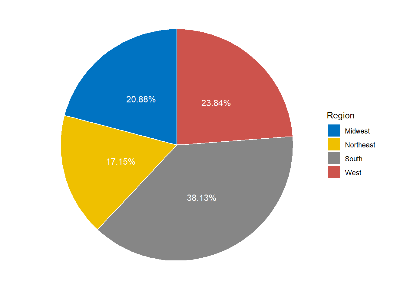
Figure 4.9: A simple ggplot pie chart for population in different regions.
Figure 4.10: An interactive pie chart for population in different regions.
Figure 4.11: Left: Pie charts with subplots for infected count. Right: Pie charts with subplots for death count.
Figure 4.12: Your first animated plot between logarithms of the death count and infected count.
Figure 4.13: Modified animation with frame = 1000 and elastic easing.
Figure 4.14: Animation of time series plot of infected count by region.